Lytx is used by enterprise fleet teams managing drivers, vehicles, and safety operations at scale.
Over time, I worked across several high-impact parts of the platform — including the Driver App, Dashboard, and Navigation — improving how people completed critical tasks in the field and in the office.
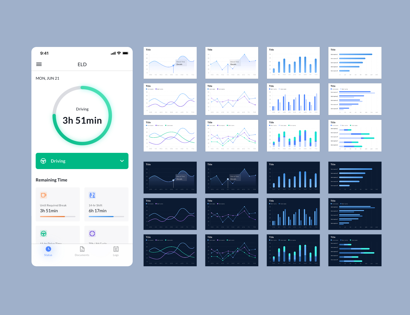
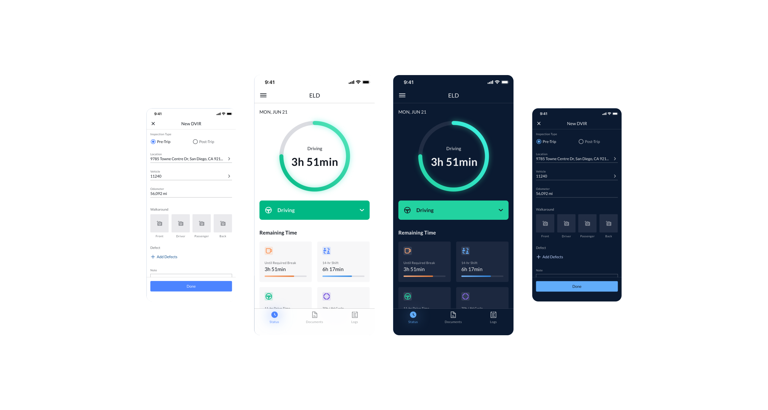
One of the most operationally important workflows I worked on was digitizing the vehicle inspection process for drivers. Before and after routes, drivers were required to inspect their trucks using paper forms, making it slower, harder to manage, and easier to lose track of.
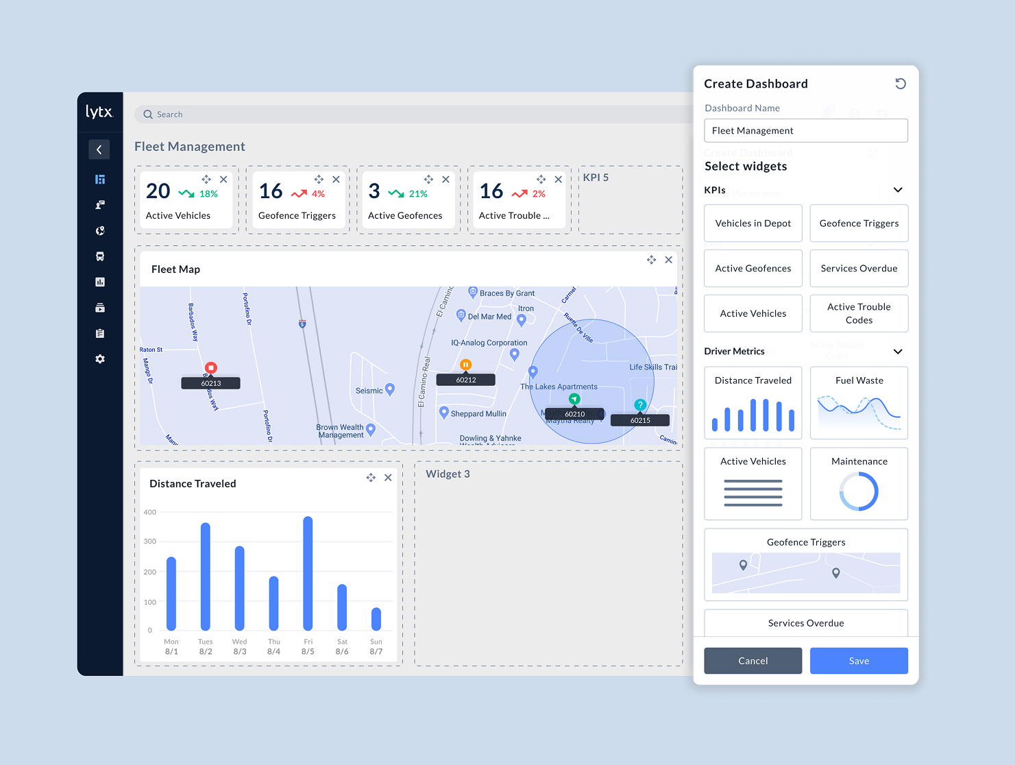
Fleet managers were working with a huge amount of data, but the dashboard treated every user the same. That meant people were seeing too much information by default, while still missing what was most relevant to their job. I redesigned the dashboard into a more customizable experience so users could prioritize the information that mattered most to their role and day-to-day decisions.
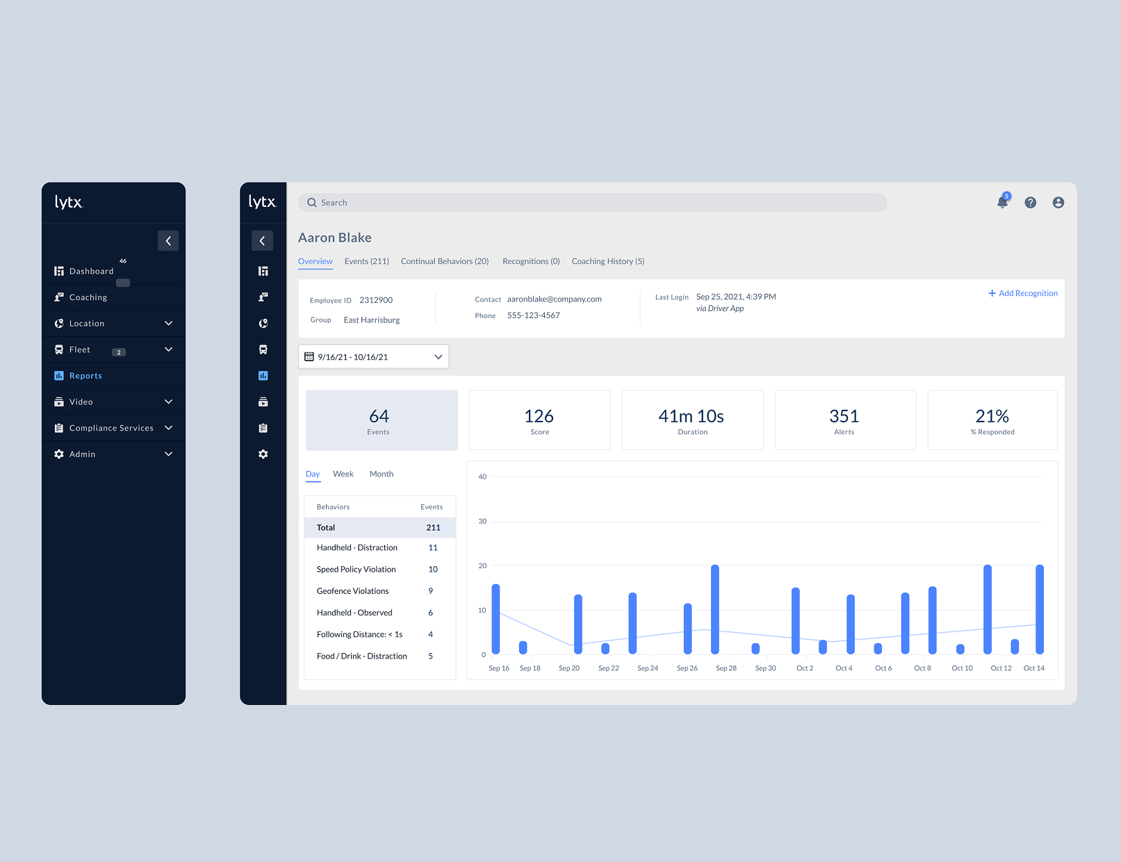
As the platform grew, navigation had become harder to move through efficiently. Finding the right page often required too many steps, and the structure added friction to workflows that users repeated every day. I reworked the information architecture into a cleaner, collapsible sidebar to reduce navigation overhead and make the platform easier to move through.
The best enterprise design makes complex work feel manageable.
A lot of this work was not about adding something new. It was about making everyday workflows easier to understand and easier to move through without taking away the depth users actually needed.