Naked & Thriving is a subscription-based skincare brand where managing subscriptions is a key part of the customer experience.
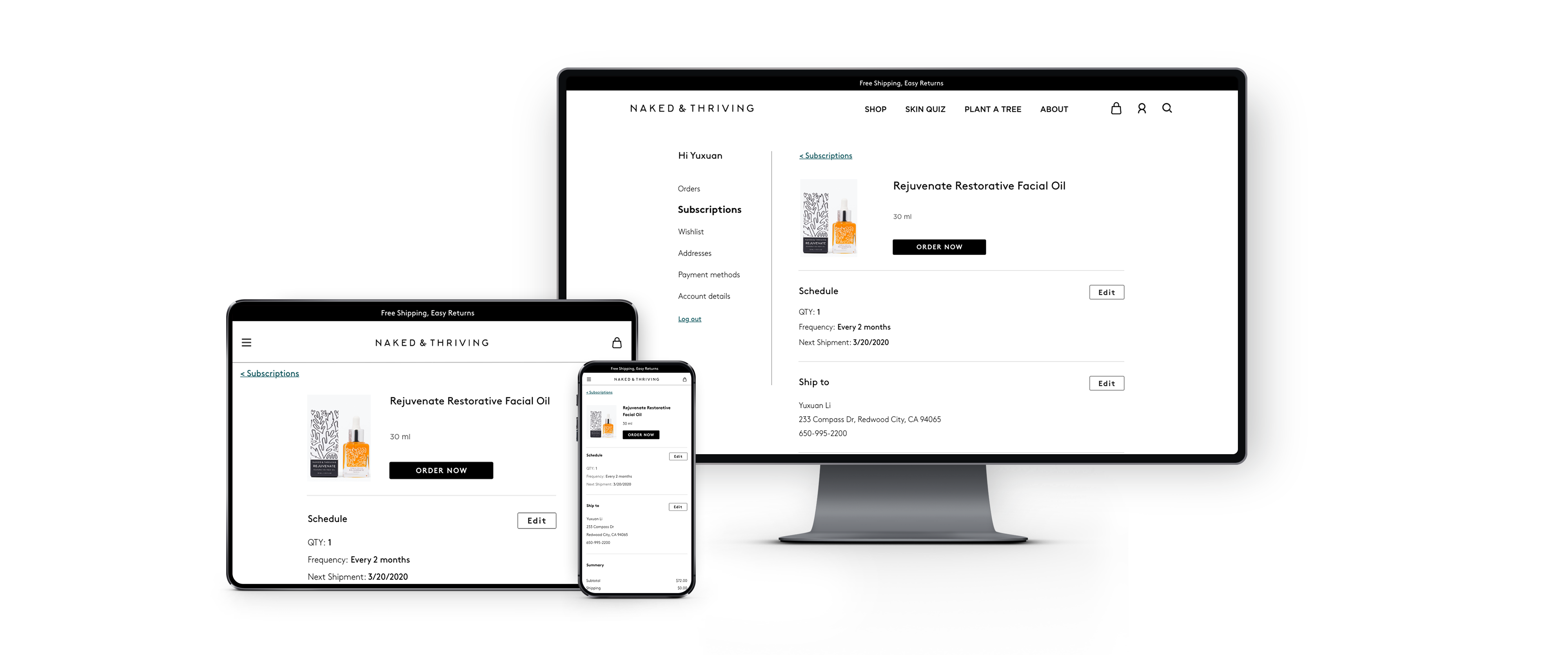
I redesigned the self-serve flow across mobile and desktop to make common subscription changes easier to complete, reducing the friction that was pushing some users toward cancellation.
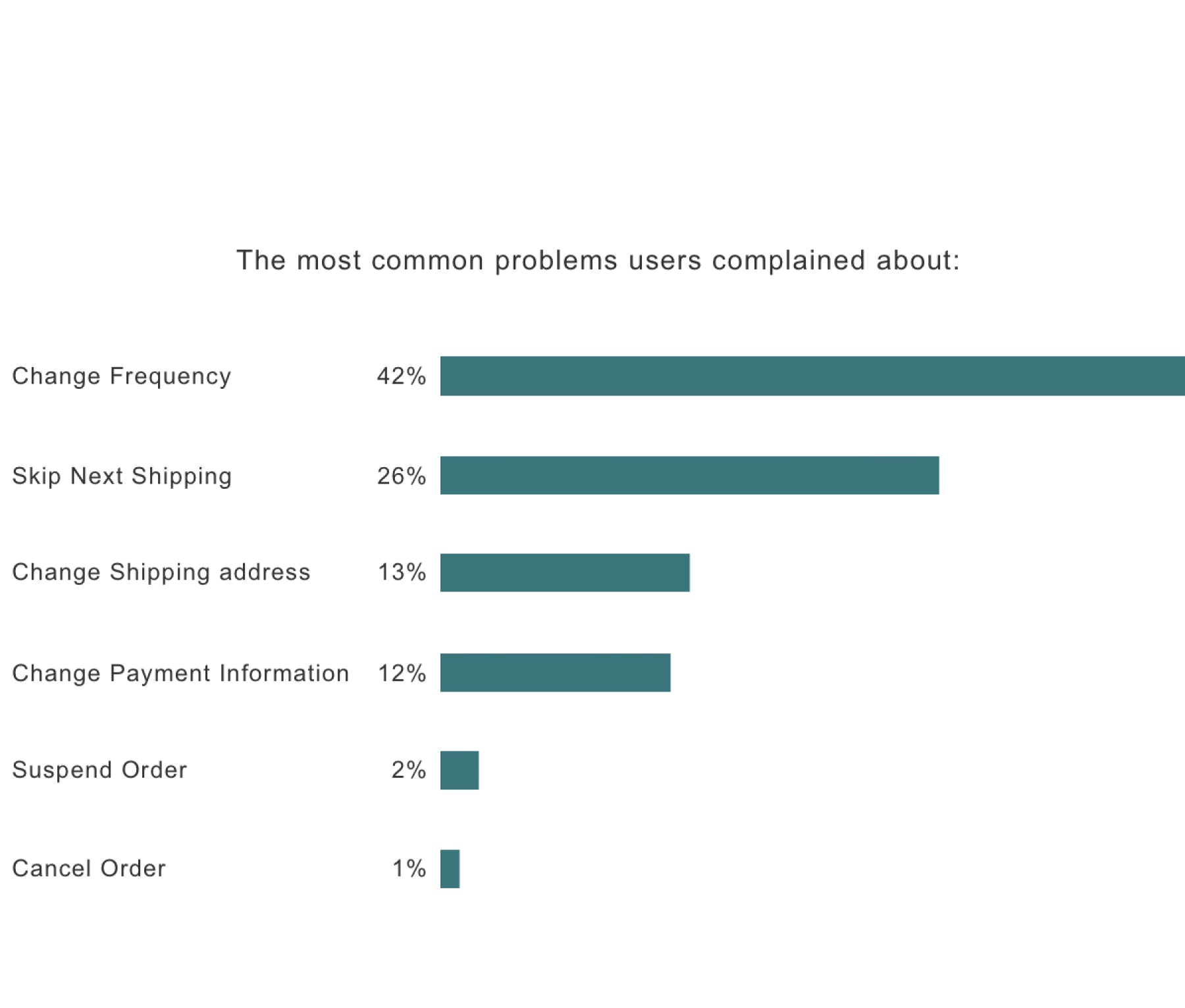
The original ask was to make cancellation harder to reduce churn. But after digging into support patterns and user behavior, I found that many users weren’t actually trying to leave, they were trying to make simple subscription changes and couldn’t figure out how.
That shifted the focus from adding friction to improving the experience, making it easier for users to do what they came to do instead of pushing them toward dead ends.
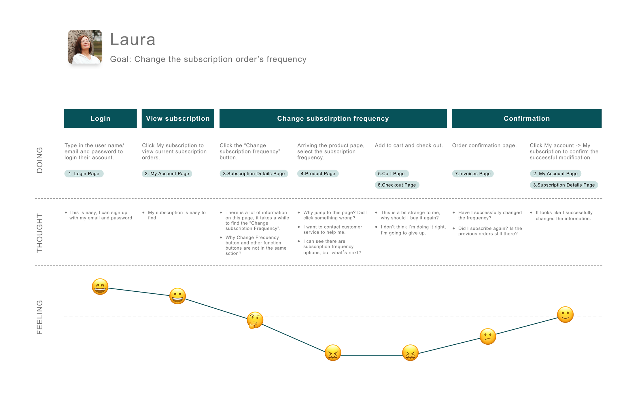
The existing experience forced users through too many pages for simple account tasks.
I restructured the flow around what users actually needed to do, not how the system happened to be organized.
That made the experience faster, clearer, and more aligned with how people manage subscriptions in real life.
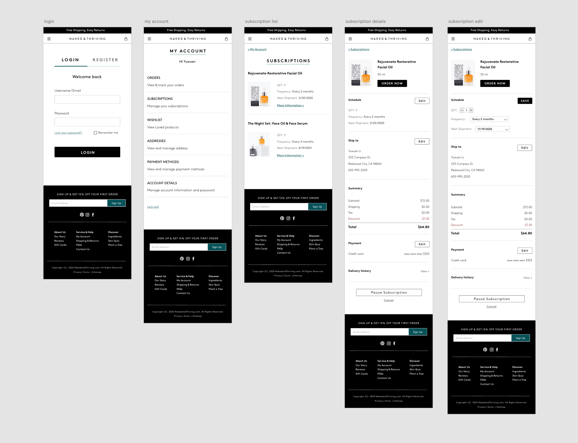
Built on WordPress and WooCommerce, some structural changes weren't possible. I had to balance user needs, business goals, and technical limitations to make deliberate trade-offs that improved clarity without ignoring retention goals.
Sometimes the real problem isn't what users are asking for, it's what they're doing instead.
Users weren't asking to cancel, they were cancelling because they couldn't figure out how to modify. That distinction changed everything about how we prioritized the redesign.